LMK Pure, Georgian Townhouse, Bayswater
Georgian Townhouse, Bayswater
This Grade II listed Georgian townhouse near London’s Hyde Park was carefully restored and transformed by Barlow & Barlow.
The restoration of this Grade II listed Georgian townhouse in Bayswater by Barlow & Barlow is a masterpiece.
Encapsulating the essence of the phrase ‘architectural gem’, this illustrious Grade II listed, 3,000 square foot Georgian townhouse, situated in central London, retains a host of classical architectural features, unlike most of the city’s other Regency townhouses, which has engendered a quite unique project.
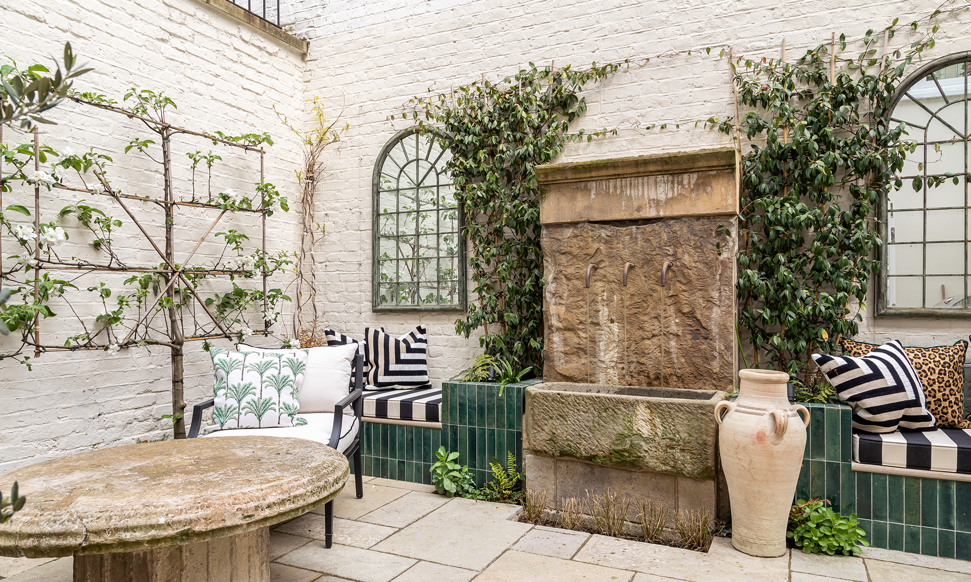


Celebrated interior design studio Barlow & Barlow was engaged to reinvigorate the five-storey townhouse with its five bedrooms and four bathrooms, light-infused orangery and secluded courtyard garden. The mandate was to retain the charm and historical value of the existing building, while injecting the qualities of a modern home. ‘It was a joy to be able to sympathetically restore key items such as damaged Georgian cornices and ceiling roses,’ says Joshua Sear, Director of Barlow & Barlow.
The audacious interior showcases Barlow & Barlow’s signature style, with classic English design at its core, but encompassing a fresh and eclectic twist. ‘Our passion is to create spaces that are both youthful and exuberant,’ says Joshua. ‘The key to the success of this project was to create a harmonious design aesthetic between a modern home and a character-filled, historical building.’
The iconic architecture of the building influenced many of the design decisions, and accentuating the historic features was paramount. Typical of Georgian townhouses, the elegant rooms are narrow with high ceilings. Taking this into account when planning the interiors resulted in several carefully considered choices.
In the kitchen, for example, the imposing white cabinetry was designed to be taller than most standard kitchen cabinets to augment the limited storage, but it deliberately stopped short of the listed decorative cornices, ensuring that they remain visible and therefore introduce subtle character. The height of the cabinets summons the eye up to the cornices. ‘Sometimes standard kitchens can make a tall room feel out of proportion,’ says Joshua. The aesthetic was deliberately kept calm and neutral to maximise the feeling of space and light, key to the clients’ requirements, evoking a clean and contemporary look. But a hint of the drama to come is divulged by the deep smoky green hue of the island, which injects a richly coloured accent.
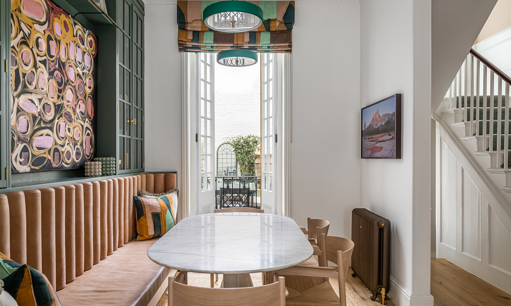
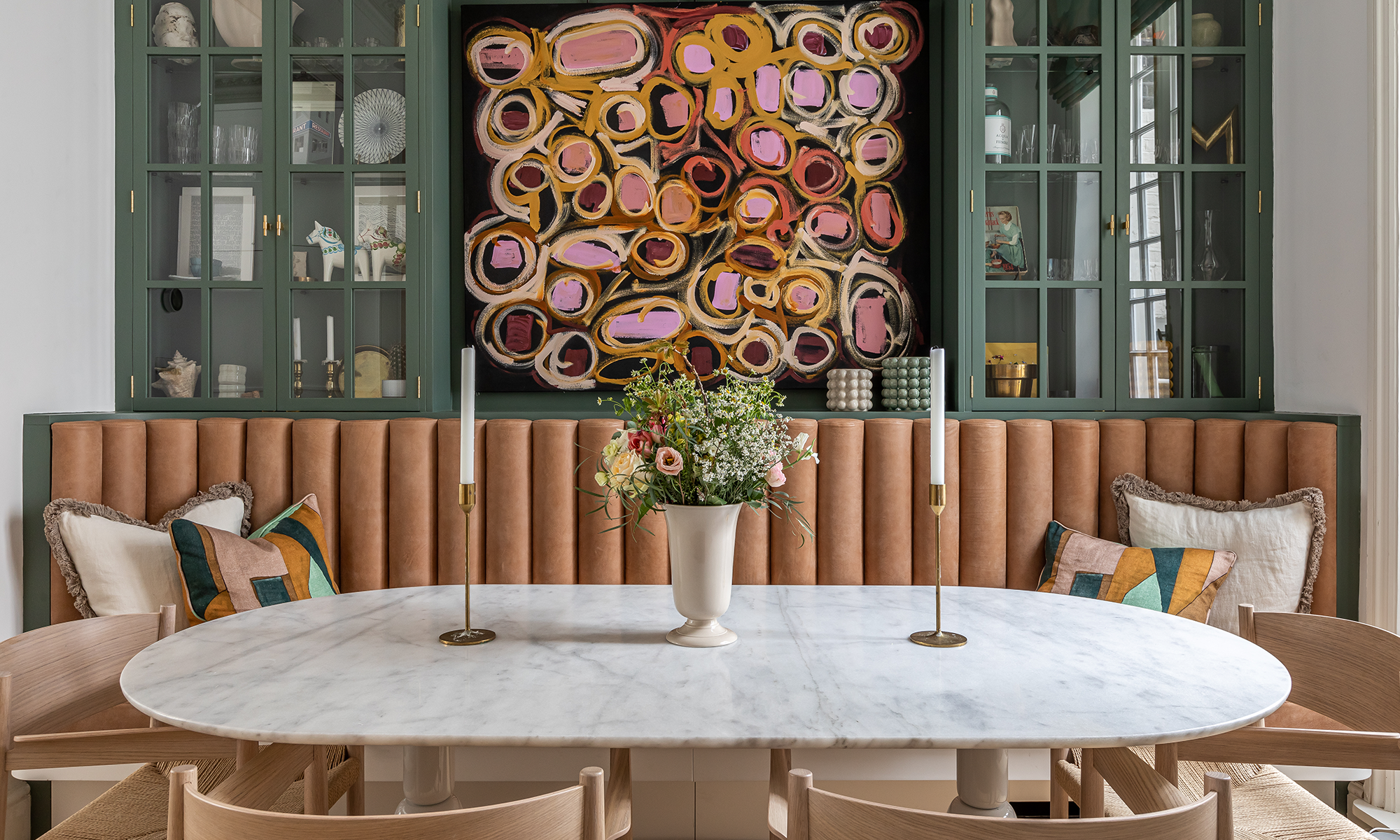
Storage was also a priority in the adjoining breakfast room and bespoke joinery affords the solution. Because this narrow room has listed chimney breasts that take up valuable space, the joinery was wrapped around them, rather than leaving them exposed. The decision was made because of the property’s numerous original fireplaces, including an elegant design in the sitting room. The breakfast room, in contrast to the kitchen, embraces colour, with the smoky green tones of the kitchen island carried through to the glazed cabinets and open shelving. Rich blues and greens are a constant thread throughout the house. The breakfast room joinery frames statement artwork from JGM Gallery, which introduces joyful bursts of colour that are teased through in the custom leather banquette, while a marble topped Pion dining table by Sancal imparts a touch of contemporary chic.
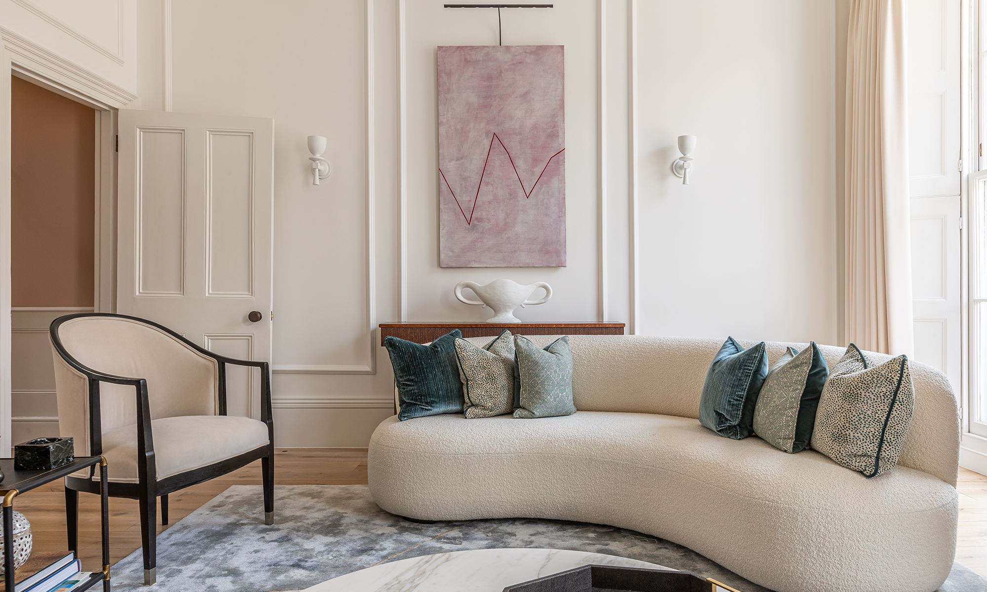
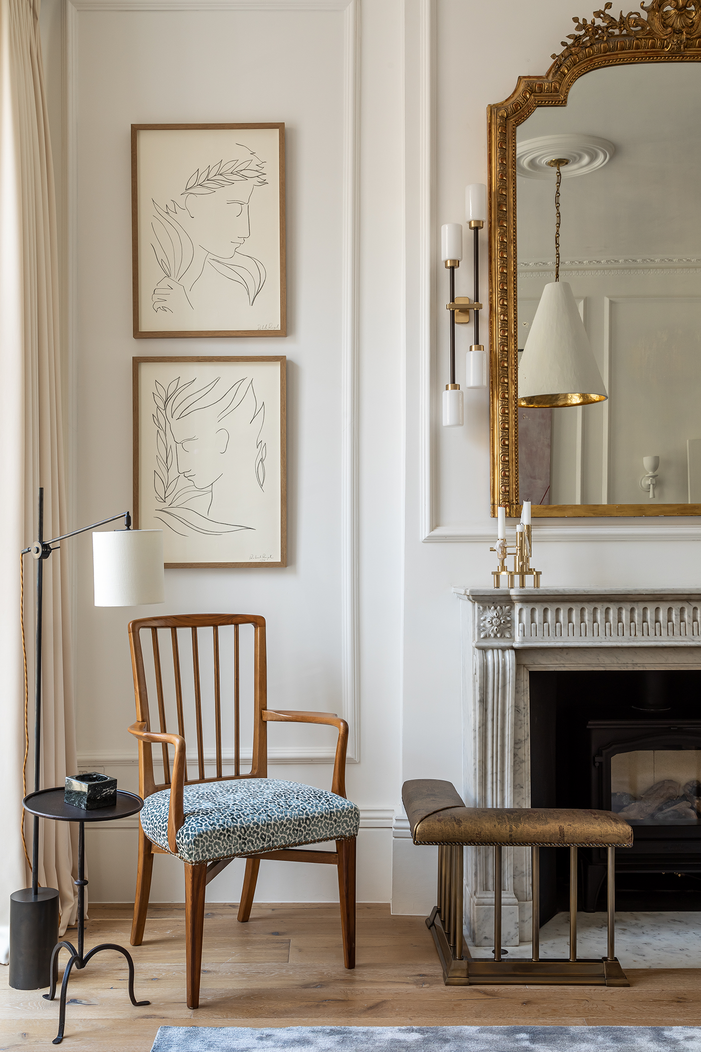


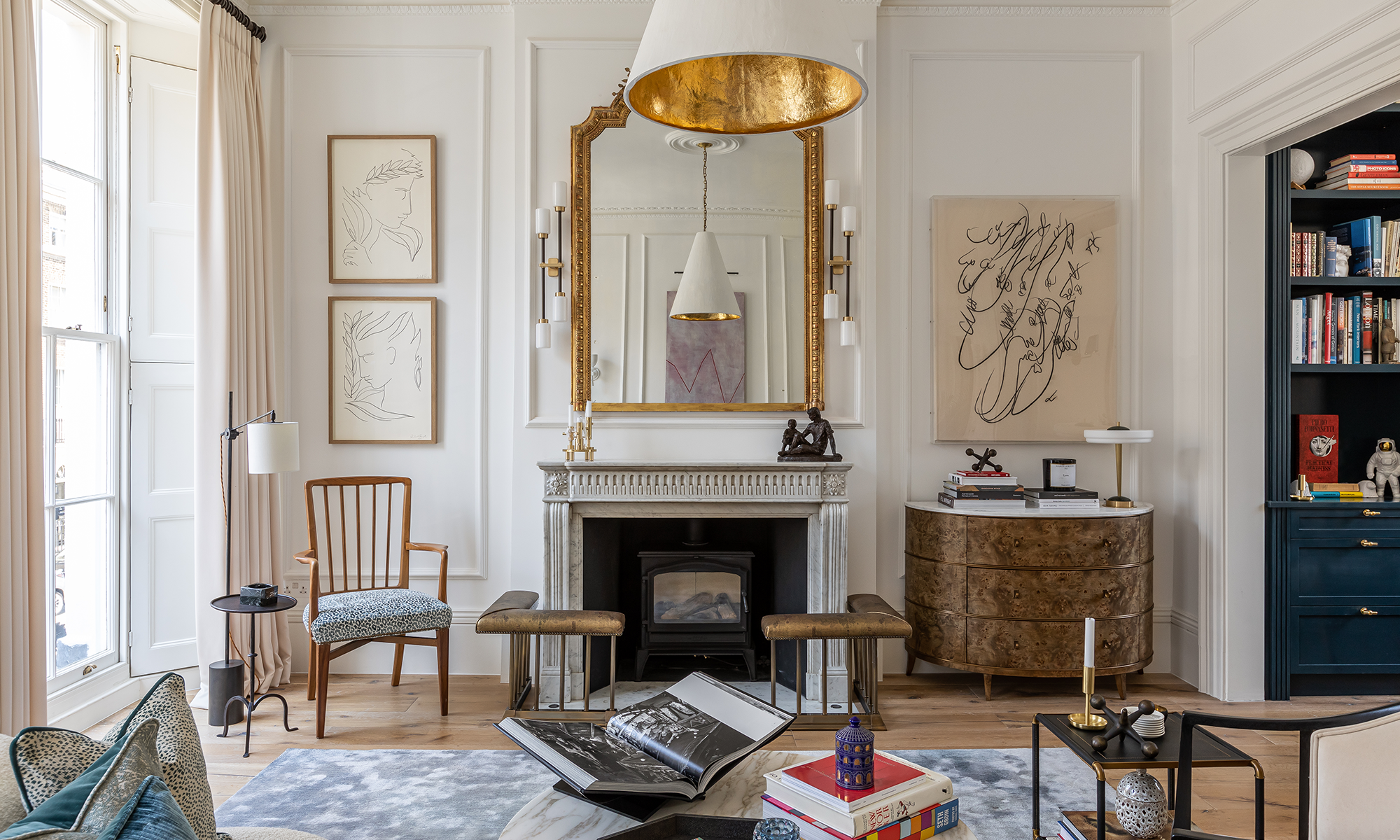
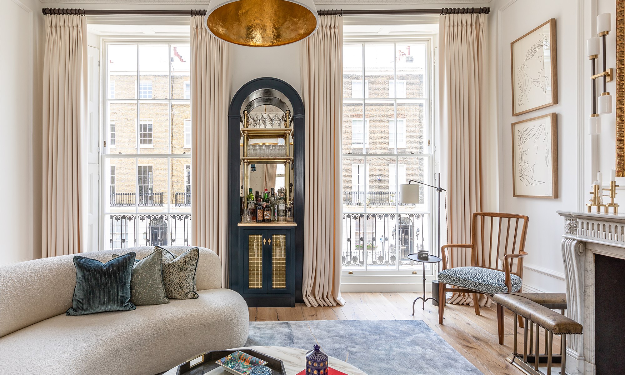
The project showcases a special balance between old and new and contemporary and traditional. As well as the exquisitely carved marble fireplace with its bespoke club fenders topped with a Dedar fabric, the sitting room features the original floor-to-ceiling windows, complete with shutters, and these immerse the room in natural light. Contemporary design and the palest of colour palettes result in an illuminated, relaxing space. Pleasing organic forms punctuate the space, from the sumptuous bespoke curved sofa by Invisible Collection to the rounded forms of vintage pieces such as the antique 1950s French armchairs and the circular marble coffee table. Scandinavian accents are a nod to the Swedish client.
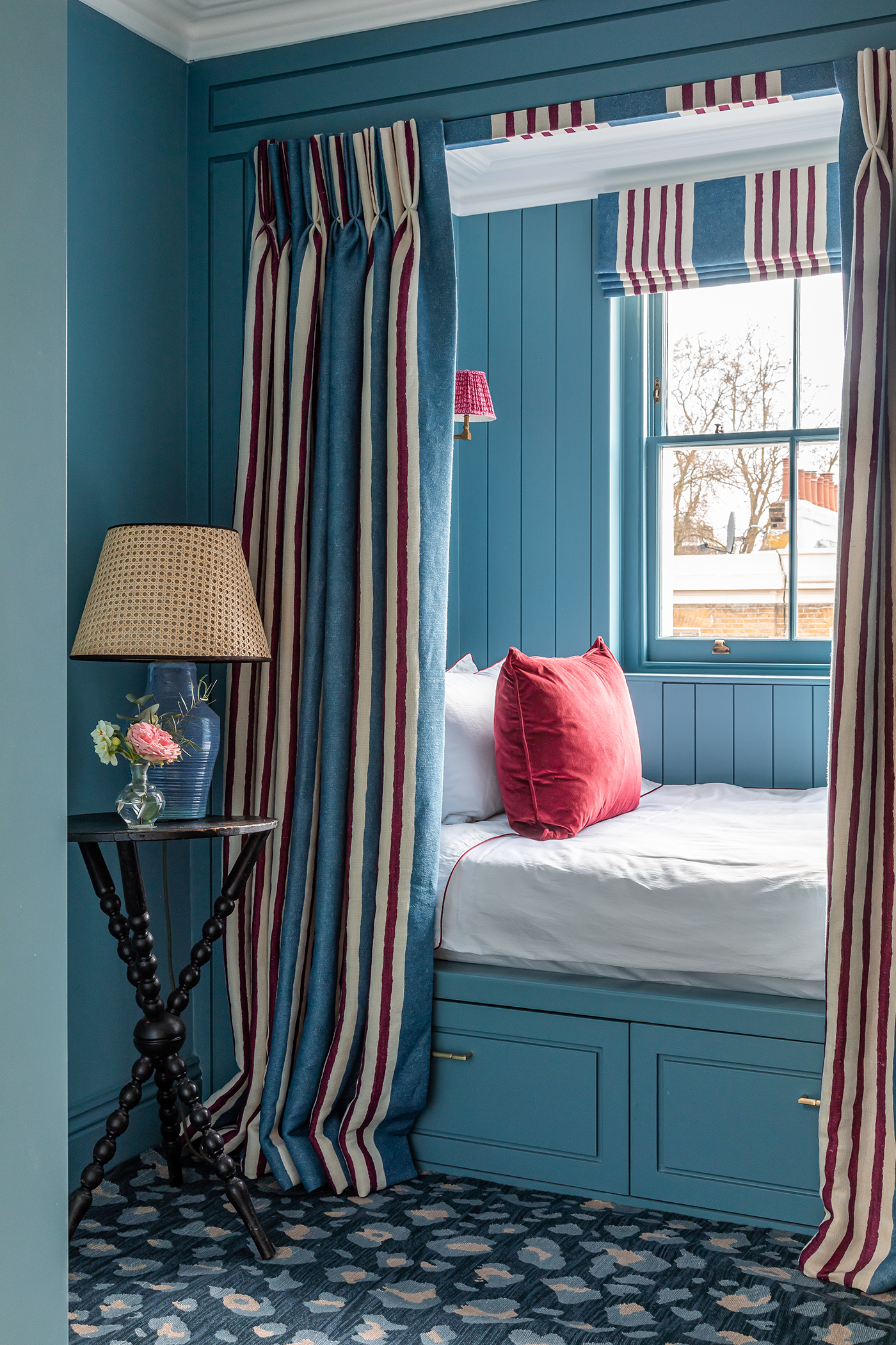
The space that proved most challenging to design was the top floor guest bedroom because its size meant it was too small to comfortably accommodate a double bed and side tables. ‘We knew if it wasn’t tackled properly, it would end up being the sad spare room where items are stored and the door shut, so we opted for a Charles Dickens approach and embraced the feeling of being almost in an attic-like room high up,’ says Joshua. A characterful bed was therefore built in, with tongue and groove panelling and decorative Shaker-style underbed drawers painted in a rich turquoise. A full-length toning striped bed curtain conjures up a cosy, hideaway ambience.
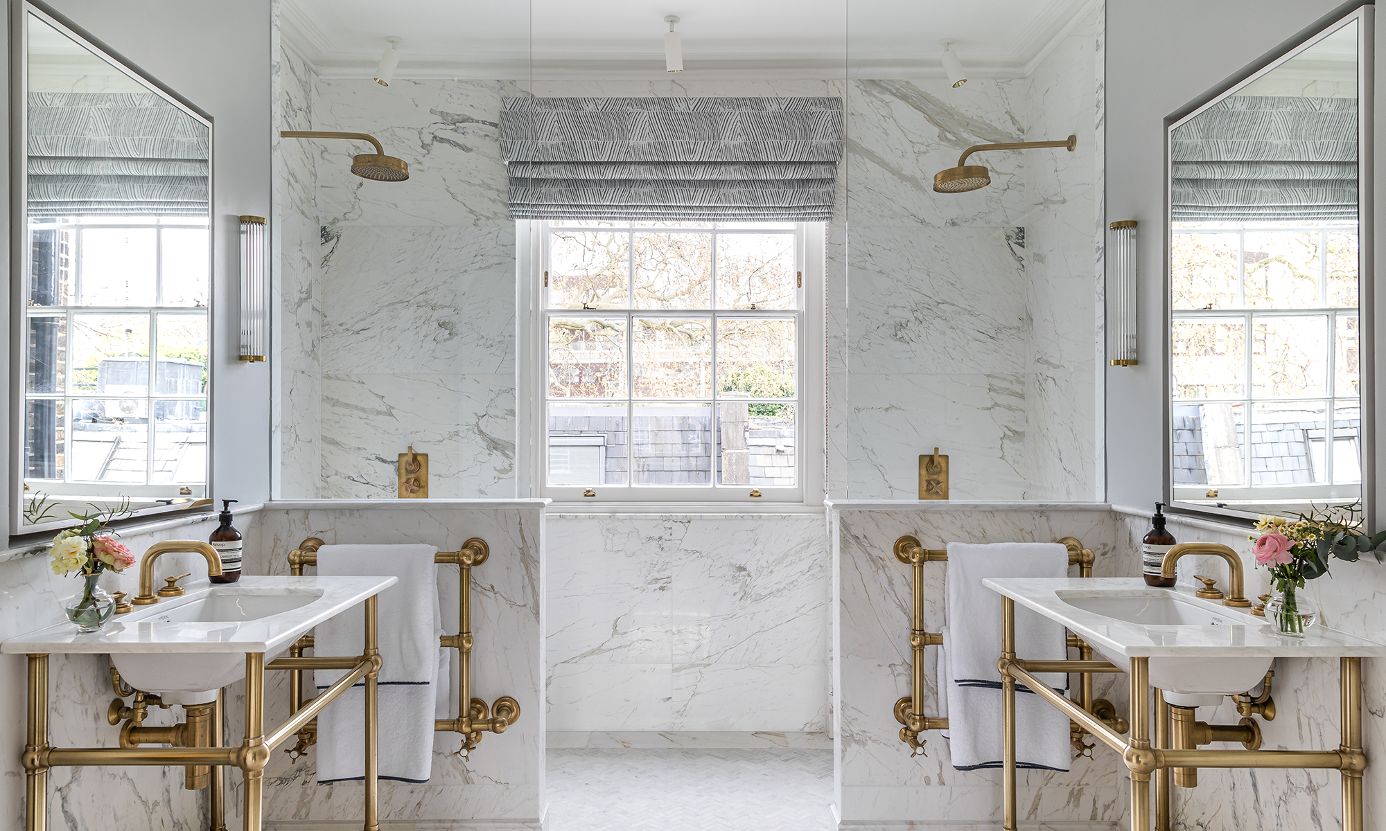
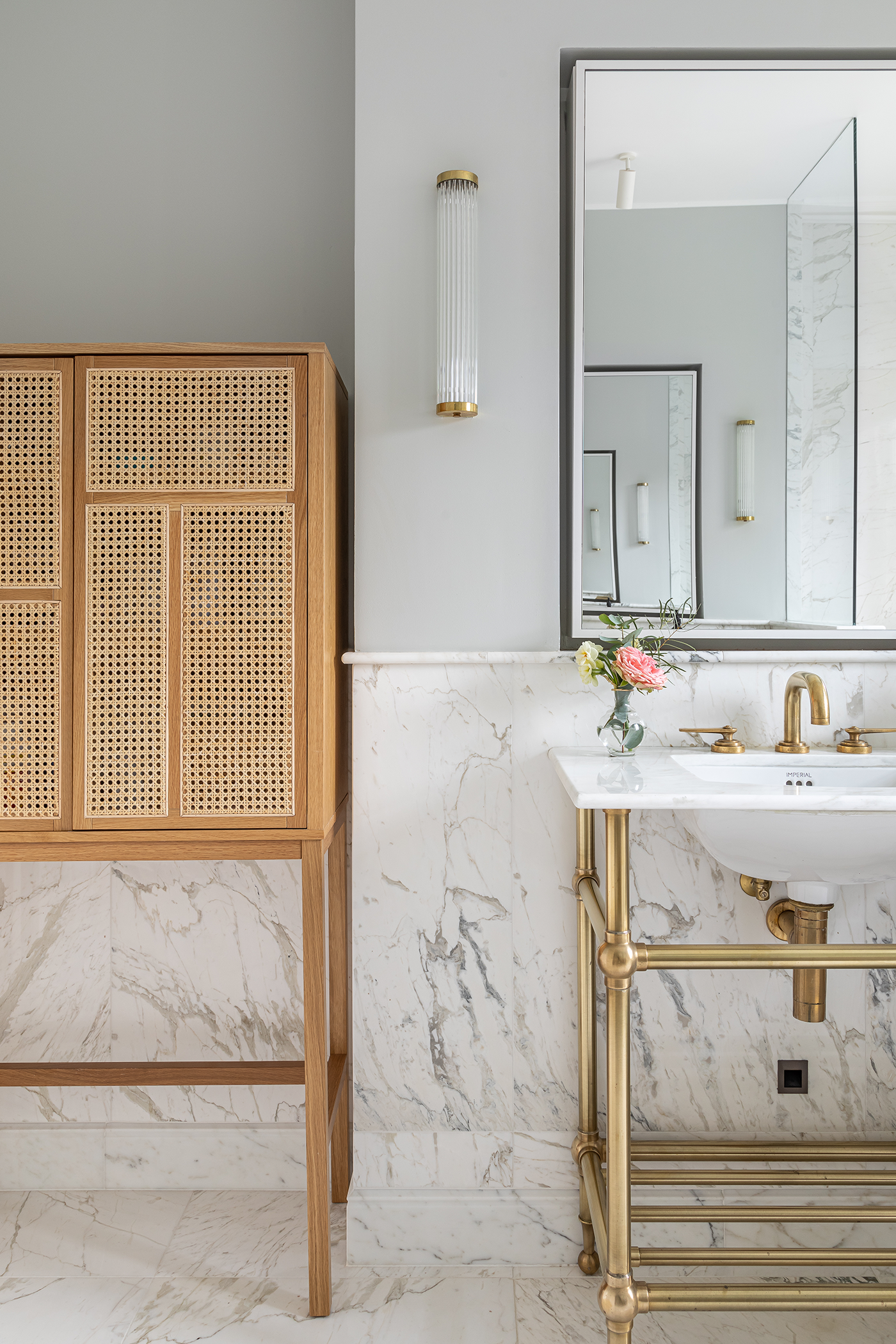
Inspired individuality was instrumental too in the design of each of the bathrooms.
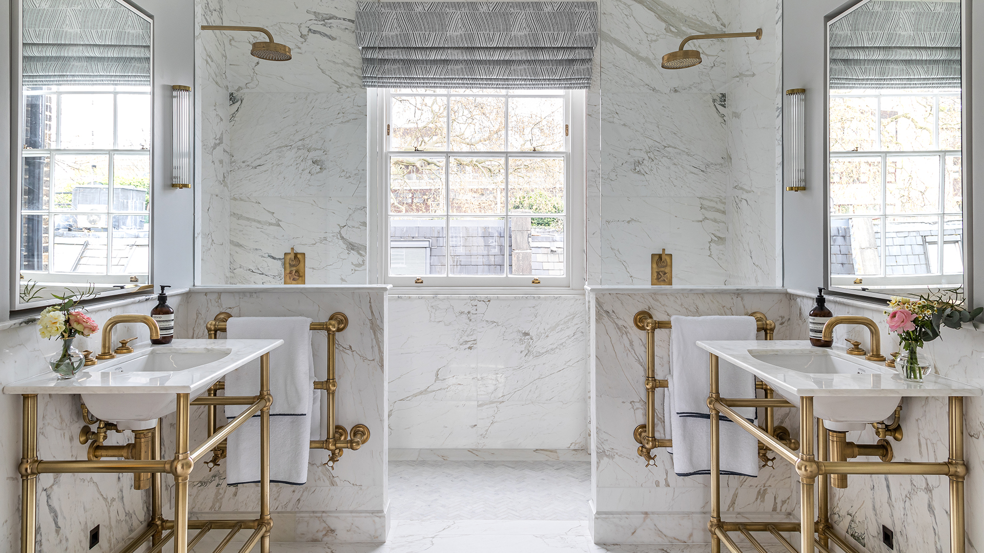
The aim with the opulent master bathroom was to create a calming space for relaxing and unwinding. ‘This bathroom is an incredibly soothing space reflecting the serene nature of the master bedroom,’ says Joshua. The clients wanted a double shower, but the large sash window prevented that. Instead, it was decided to frame the window with the symmetry of twin showers and vanities, separated by half height tiled walls to demarcate the room. The symmetry is a nod to Georgian architecture. Floors and walls are swathed in marble to induce a sumptuous air.
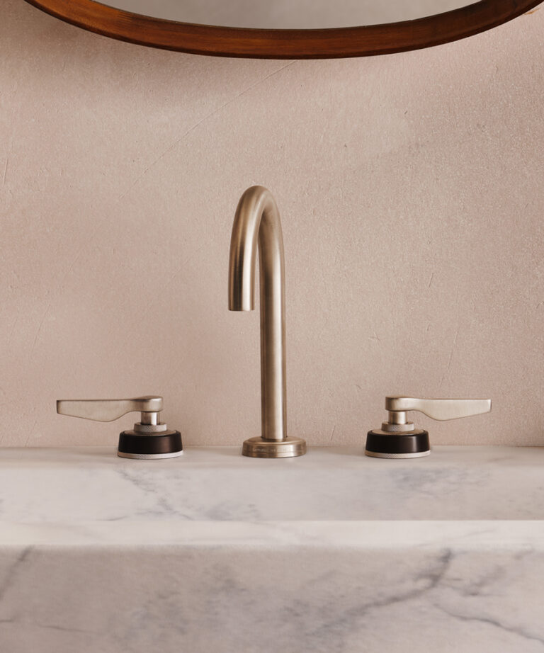
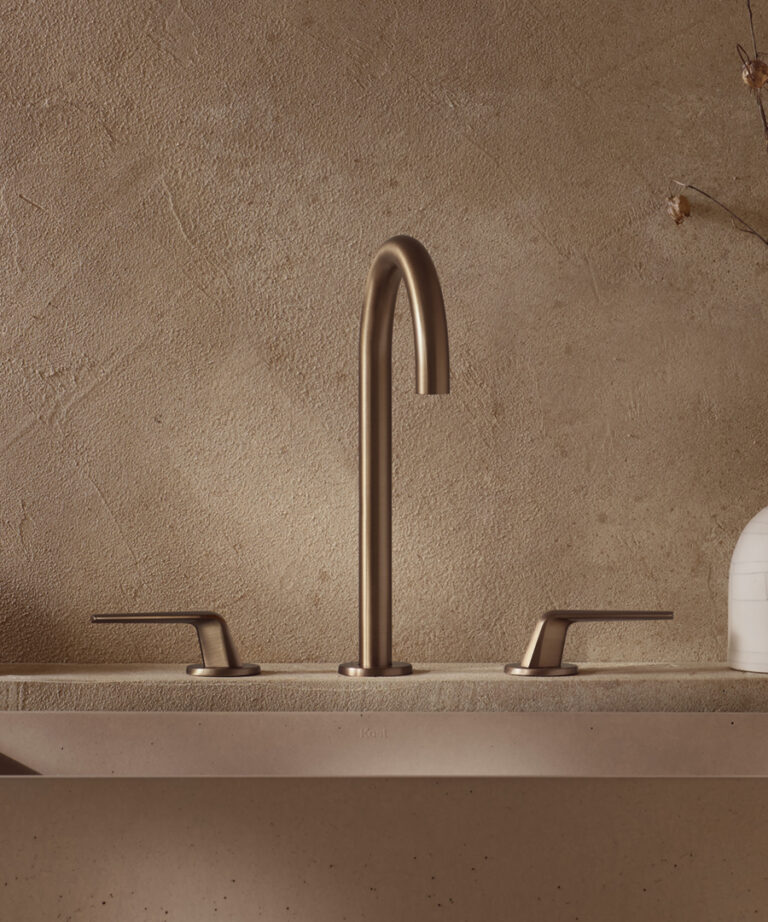
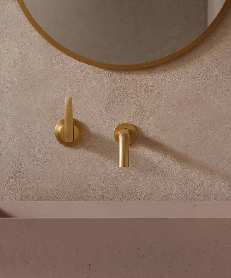
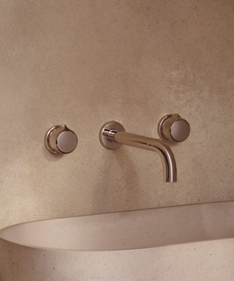
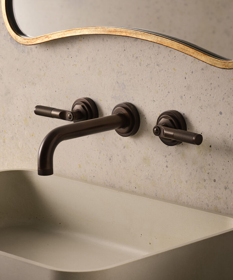
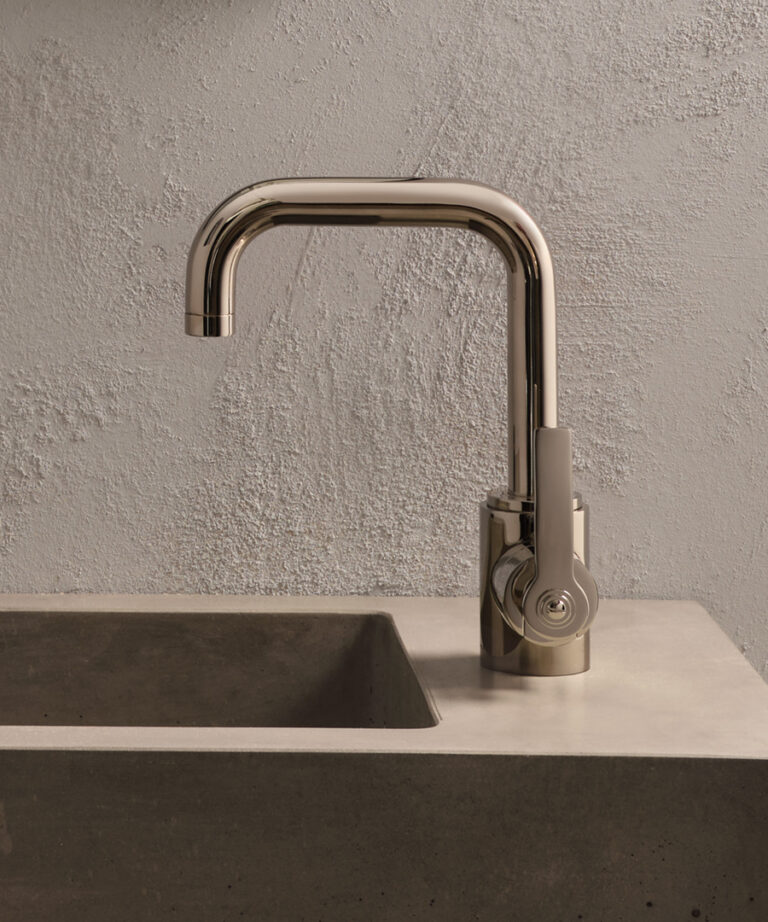
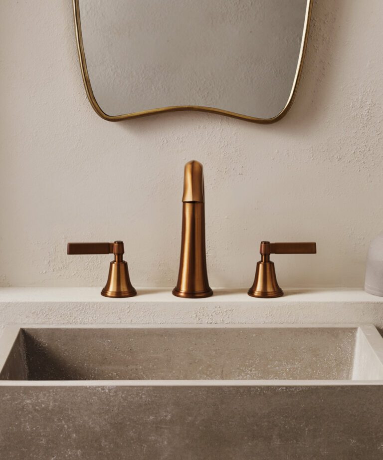
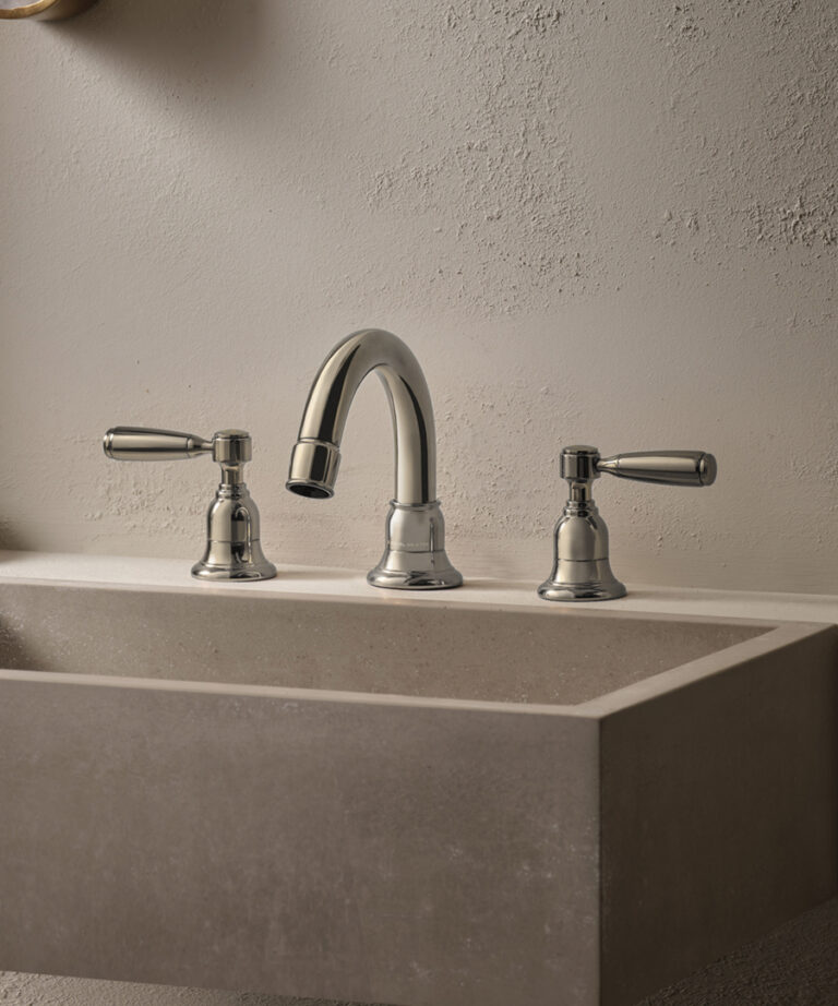
Samuel Heath’s LMK Pure brassware in Urban Brass, with its Bauhaus aesthetic overtones and exquisite details, was selected for the shower and basin fixtures. The sleek lever taps enhance the elegance of the vanities. ‘Barlow & Barlow are well known for their love of unlacquered brass as it adds a certain warmth to a space,’ says Joshua. ‘We admire how it changes and patinas naturally over time, adding a level of character and richness to a design over time.’
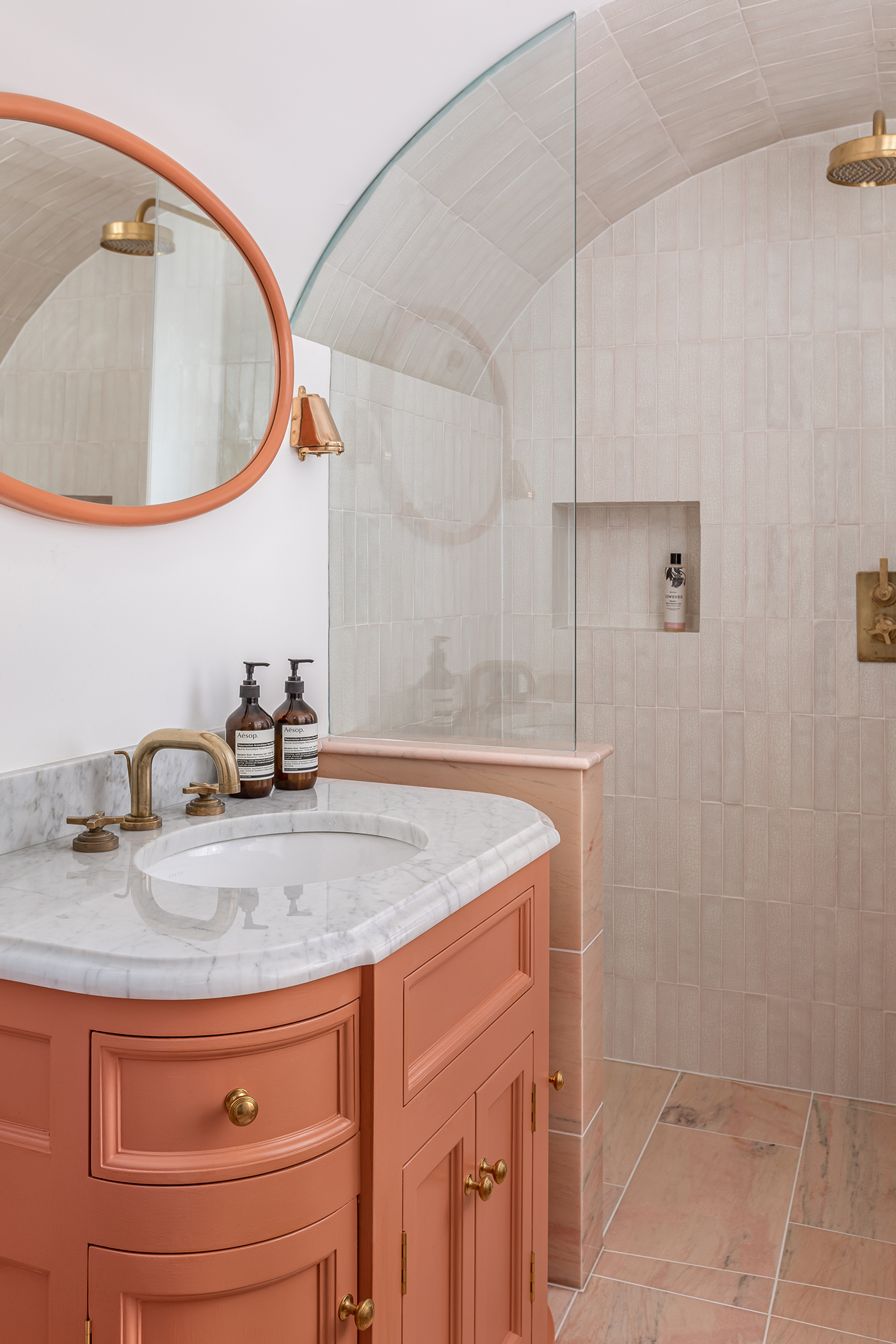
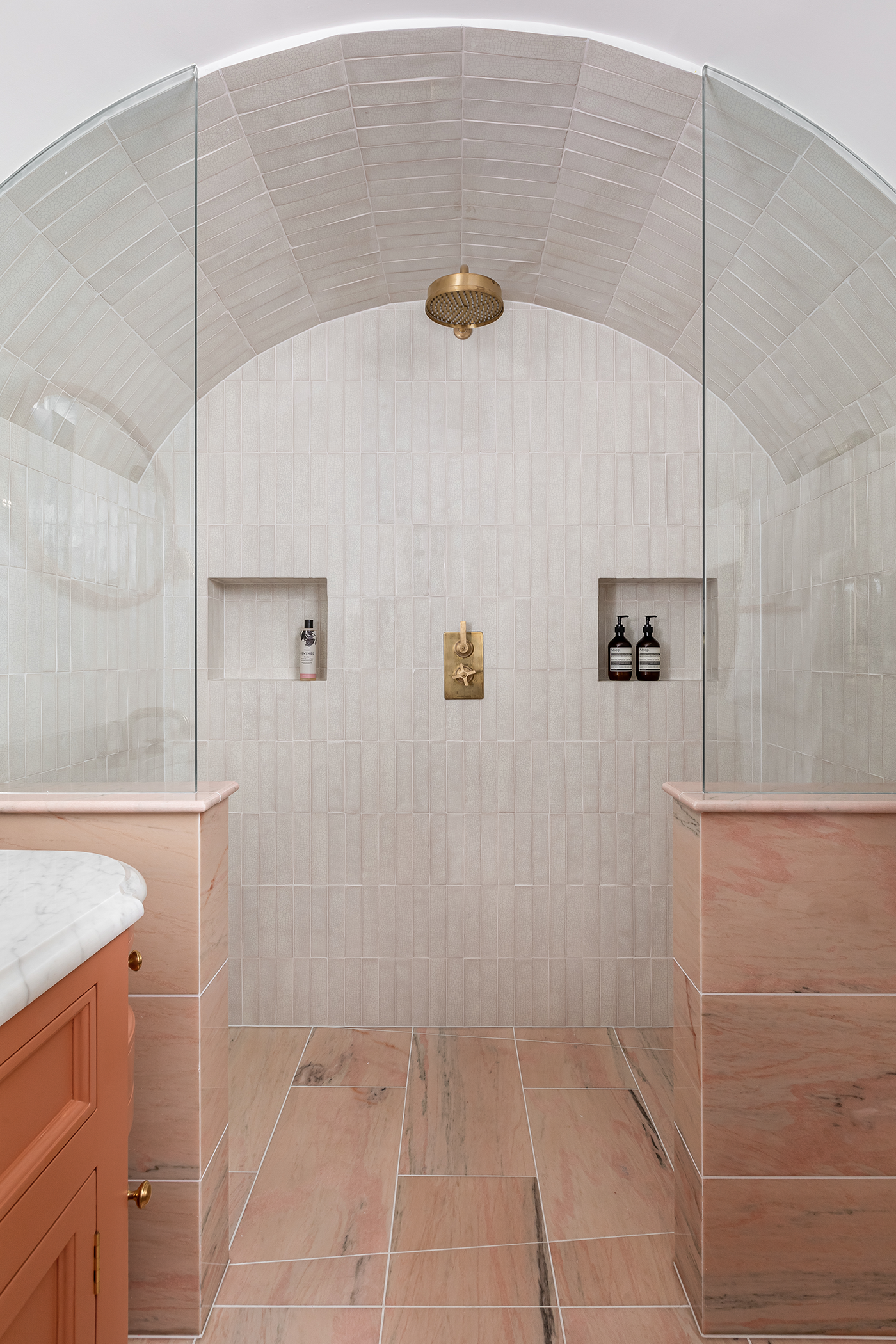
A cosseting spa-like ambience was evoked in the atmospheric guest bathroom with its vaulted shower and tiled arched ceiling. The warm pink and coral colour palette, continued from the bedroom, exhibits cohesion. Handmade crackle tiles and striking pink marble from Artisans of Devizes complement the bold coral tone of the vanity and enrich the enveloping mood. Again, the shower and basin fixtures are from the LMK Pure collection in Urban Brass, with stylish cross top taps elevating the drama of the curved vanity, the shape of which echoes the arched ceiling. ‘The LMK Pure collection is a modern touch in a traditional scheme that overall balanced out the aesthetic in this bathroom,’ says Joshua. ‘As brass naturally changes over time, it felt fitting to feature it in this shower, which has changed and developed over time.’
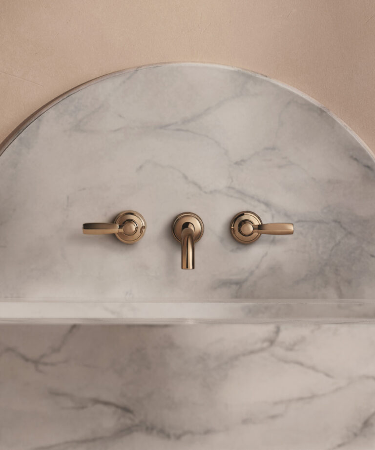
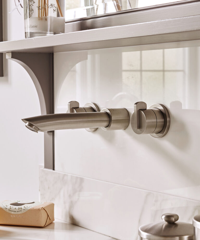
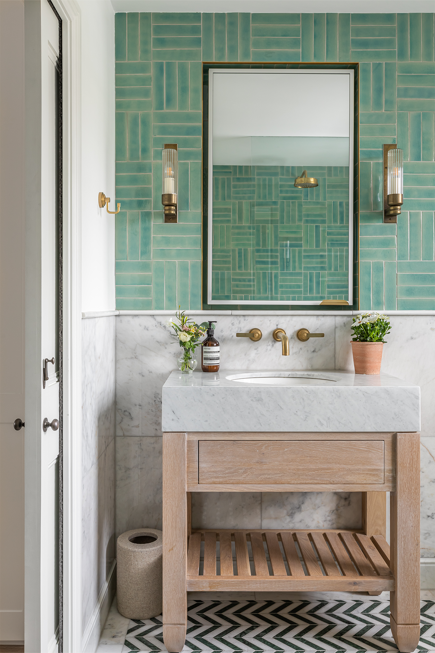
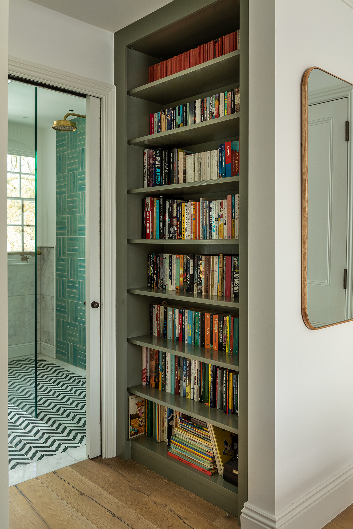
Colour and pattern play were key to the design ethos of the eclectic guest ensuite bathroom. Walls with basket weave-effect emerald green tiles are teamed with calming marble tiles below the dado, while a striking monochrome chevron striped floor elicits drama underfoot. The focal point timber vanity, topped with Carrara marble, injects warmth, and is beautifully complemented by the LMK Pure wall mounted three hole basin filler in Urban Brass with lever taps, which instil a level of sophistication and balance to the scheme.
- Product:
- LMK Pure
- Finish:
- Urban Brass
- Designer:
- Barlow and Barlow
- Photography:
- Jonathon Bond
